The Psychology of the First Impression: How Your Biodata Design Affects Perceptions
Last Updated: July 5, 2026
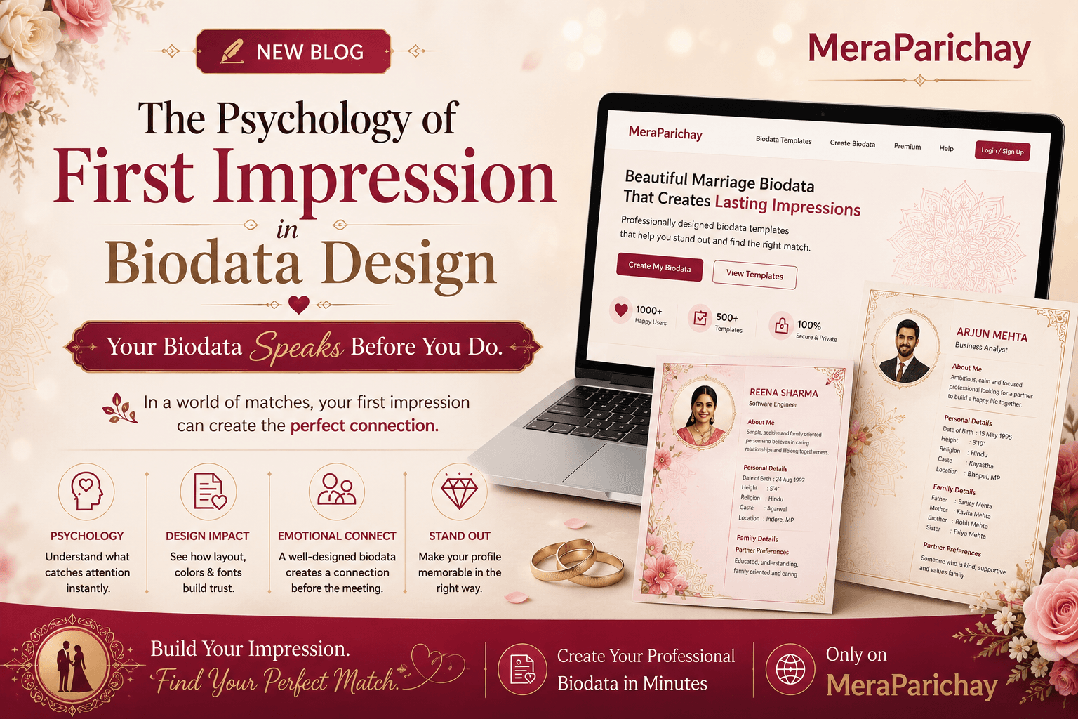
When someone opens your marriage biodata, you have only a few seconds before they form an opinion about you — and that opinion is shaped by layout, spacing, and font long before a single sentence is actually read. This isn't shallow; it's how human perception works. Understanding it can help you design a biodata that represents you accurately, instead of one that quietly works against you.
1. Why First Impressions Form So Fast
Psychologists call this the halo effect — one positive or negative trait colors how we judge everything else about a person. In a document, design elements act as stand-ins for traits we can't directly observe:
- Clean spacing reads as organized and thoughtful
- Consistent fonts read as attentive to detail
- Balanced color use reads as good taste, not showy
- Clear structure reads as clarity of thinking
None of these are actually about you. But the brain uses design as a shortcut for character, because judging character directly takes time — and first impressions don't wait.
2. Whitespace Signals Confidence, Not Emptiness
People new to biodata design often try to fill every inch of the page, worried empty space looks incomplete. It's the opposite. Generous margins and breathing room between sections read as self-assured; cramped text reads as anxious or disorganized — even when the content is identical.
Instead: Let sections breathe with consistent spacing, even if the biodata runs slightly longer
3. Font Choice Sets Emotional Tone Before a Word Is Read
A heavy, ornate script font might feel "traditional," but past a certain point it reduces legibility — and readers unconsciously associate difficulty reading with fatigue, which they then misattribute to the person, not the font. A clean serif or simple sans-serif for body text, with slightly more character reserved for headings only, keeps things warm without sacrificing clarity.
4. Photo Placement Carries More Weight Than Photo Quality
A well-placed, appropriately sized photo — with breathing room around it, not crammed against the text — is read by the viewer as this person is comfortable and considered. An oversized or oddly cropped photo, even a genuinely nice one, can trigger unconscious unease the reader won't be able to name.
5. Section Order Shapes What Feels Most 'Important' About You
Because of the primacy effect, whatever appears first is unconsciously weighted as most defining. Leading with a rigid list of height, caste, and income before a warm one- or two-line personal introduction sets a transactional tone. Many modern formats now open with a brief personal line, then move into structured details — giving the reader a person to picture before a spreadsheet to evaluate.
6. Color Is Doing More Work Than You Think
Overly saturated colors or heavy background patterns compete with the text for attention, forcing the reader's brain to work harder to extract information. Psychologists call this processing fluency — lower fluency is consistently linked to lower trust and likability judgments, independent of the actual content. Muted, harmonious palettes with one accent color let the words carry the impression instead of fighting the design for attention.
Design a Biodata That Gets This Balance Right
None of this means your biodata needs to look corporate. Warmth, personality, and cultural elements — a subtle motif, a soft color palette, a thoughtful photo — belong in a document meant to introduce you as a person, not just qualify you. The point is that design is never neutral packaging; it's read in the same instant as the text, and it frames how those words land.
MeraParichay.app's templates are built around exactly this balance — clean structure, generous spacing, and a photo layout that gives the reader room to actually see you, not just scan you.
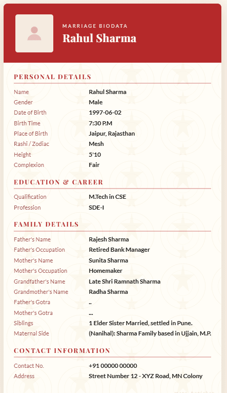
See the Difference Good Design Makes
Frequently Asked Questions
Q: Does biodata design really affect how I'm judged?
Yes — research on impression formation shows early visual cues anchor how later information is interpreted, even when the content itself doesn't change.
Q: Should I use a decorative or traditional-style font?
Use character in headings only. Body text should stay in a clean, highly legible font so the reader's attention goes to your details, not the typography.
Q: What's the single biggest design mistake people make?
Leading with a dense block of personal statistics instead of a short, warm introduction — it sets a transactional first impression before the reader knows anything about you as a person.
Build a Biodata That Makes the Right First Impression
Choose from 25+ professionally designed templates built around clean spacing, balanced typography, and thoughtful photo placement — free, no watermark, no sign-up.
Browse Biodata Templates